Contact
What are you interested in?
UX/UI Design.
UX design (user experience) determines how a digital product works: structure, navigation, the order of the steps. UI design (user interface) determines how it looks and feels: colours, typography, components, states. UX is the blueprint, UI is the visible surface on top — together they form what people actually operate.
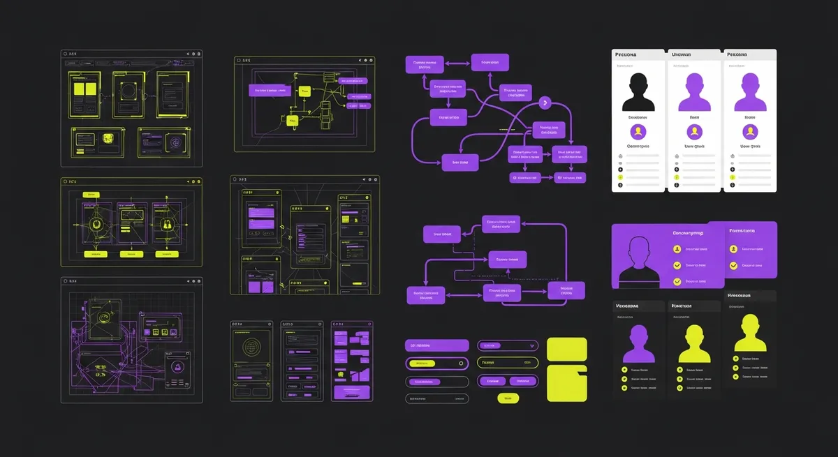
UX/UI Design — Explained in Detail
UX design and UI design are almost always named in one breath because in practice they happen on the same screen. They are, however, two different jobs. UX design (user experience design) answers whether someone reaches their goal: Do they find the information? Do they understand what happens next? How many steps does it take to send an enquiry? That means talking to and observing users, reading analytics, mapping user flows and testing grey, unstyled drafts (wireframes) before anything is made attractive.
UI design (user interface design) answers whether the result is legible, consistent and operable: typography and line lengths, colour and contrast ratios, spacing, icon language, button states (default, hover, focus, disabled, loading), error and empty states. A UI design is not finished when the happy path looks good — it is finished when the error case, the very long text and the empty list are defined too.
The term user experience goes back to Don Norman, who coined it at Apple in the early 1990s because interface felt too narrow to him: the experience also includes expectation, context and everything that happens before and after the screen. Methodically the discipline is described in ISO 9241-210, which defines human-centred design as a loop — understand the context, specify the requirements, produce solutions, evaluate against the requirements, and repeat until the result holds.
In practice: UX without UI stays a diagram nobody uses. UI without UX is a beautiful surface over a flow nobody understands. Anyone who buys only one of the two still gets both — one of them unconsciously and untested. How DLM Digital combines the two layers as a service is described under Custom UI/UX; the agency page with process, packages and contacts is UX Agency Zurich.
UX design vs. UI design — the differences
How a UX/UI project actually runs
Step one is understanding, not drawing. Who are the users, what task do they arrive with, under what conditions do they complete it? That does not require a large study: five to eight conversations with real customers, a look at the pages with the highest drop-off, and the questions the business already answers on the phone every day. Those questions are the most reliable source for the structure of a website.
Step two is structure. What content exists, how is it grouped, and what are the menu items called in the users' language rather than the org chart's? From this come user flows for the two or three tasks the product is genuinely measured on — for an SME usually understand the offer, build trust, get in touch.
Step three is wireframes: deliberately grey, unstyled drafts. Dropping colour is intentional. As long as nothing is pretty, everyone argues about order, scope and clarity instead of taste. A change costs minutes at this stage; the same change after development costs days.
Step four is the UI design and the clickable prototype, usually in Figma. What matters is that the prototype shows more than the happy path: loading states, validation errors, empty lists, very long product names. States discovered only during development are not designed — they are improvised.
Step five is testing. Five test participants uncover roughly 85 percent of the observable usability problems in a prototype, according to Jakob Nielsen of the Nielsen Norman Group, based on Nielsen and Landauer (1993). That figure covers problems you find by watching people, not questions of taste or market acceptance. It is still the reason a five-person test almost always beats another internal review round.
Step six is handover. A design system keeps colours, typography, spacing and components in one place so the twentieth screen still looks like the first. Without one, every project drifts as soon as more than one person works on it.
A concrete example: the project calculator on this site
An example we can disclose because it sits on this domain: the most common question before a web project is what it will cost. The usual agency answer is a contact form — hand in your question and wait for a call back. Convenient for the agency, and the drop-off point for the user.
The UX decision was to answer the question before the form rather than after it. That became the project calculator: a few inputs on scope, number of pages and features, and a range at the end before any address is entered.
The UI decisions are the layer above and just as decisive here: one step per screen instead of one long form; visible progress so it is clear how much is left; large answer targets reachable with a thumb on a phone; and a result stated as a range rather than false precision — a number nobody believes helps nobody.
The point of the example is not the tool. The point is the order: first the users' question was identified, then the flow was built, then the surface was designed. The other way round produces a pretty form that still leaves the question unanswered.
UX designer, UI designer, product designer — who does what
In large organisations the roles are separate. A UX designer or researcher works on research, information architecture, flows and testing. A UI designer works on visual language, component library and the accessibility of the surface. An interaction designer handles motion and feedback, a content designer the words in the interface — labels, error messages, empty states. They sound like details and frequently decide between abandonment and completion.
In Swiss SME projects these roles are almost never separate. One person does what four people do in a corporation — which is fine, as long as the order holds and the testing does not get skipped. Product designer is today's usual umbrella term for exactly that profile.
One distinction matters: a design team is not a development team, and a Figma prototype is not a website. Between the finished design and the working product sits implementation — and that is where design is most often lost when design and development are bought separately. What that handover looks like on a web project is described under web design Zurich.
This page is written by an agency and describes the discipline from a client's point of view. Anyone researching careers, education or salaries is better served by universities, professional bodies and the Nielsen Norman Group — we do not train designers and have nothing verifiable to say about it.
Accessibility belongs inside UI design, not beside it
The W3C Web Content Accessibility Guidelines (WCAG), version 2.2, are the usual reference point. For day-to-day design work they mean four things above all: sufficient colour contrast between text and background, every function reachable by keyboard, a visible focus ring, and form fields with real labels rather than placeholder text only.
These four are not special equipment for a small group. Contrast helps anyone looking at a phone outdoors; keyboard operability helps anyone working fast; real labels help anyone returning to a form after an interruption. More under digital accessibility.
Legally the Swiss picture is layered: binding requirements apply first to federal bodies and public administration. Companies selling products or services into the EU market, however, fall under the European Accessibility Act, which has applied since 28 June 2025. For a Swiss company with EU customers, accessibility is therefore no longer purely a question of style. Have the specific case assessed by a lawyer — we deliver the technical and design implementation, not legal advice.
What UI/UX design costs — and when it is not worth it
At DLM Digital a UX audit of an existing site starts at CHF 1,500. A UX/UI design sprint for a defined area — a landing page, a sign-up flow, a configurator — starts at CHF 6,000. A full product design with research, design system and testing starts at CHF 15,000. A complete website including implementation ranges from CHF 3,000 to CHF 25,000 depending on scope; a validated prototype for a new digital product starts at CHF 10,000.
And now the part agencies rarely write: there are cases where a dedicated UX project is the wrong spend. If you need a five-page company website with a contact form and your offer explains itself in one sentence, a UX process with research and test rounds is over-specified. Take a properly built standard layout, put the difference into text and photography, and get real value out of it.
Also the wrong order: a redesign while nobody knows why visitors leave. Redesigning without data swaps one untested design for another and leaves you with a new opinion. Start with analytics, a handful of user conversations and an audit; that costs a fraction and tells you whether a redesign is the problem at all.
And a third case: if the real weakness sits in the offer, the price or the sales process, no interface fixes it. A better form does not sell a product nobody wants. We would rather say that in the first conversation than after the third invoice.
How to measure good UX/UI design
Useful measures are: task success rate (how many test participants complete the task unaided), time to goal, the drop-off rate at every single step of a flow, the number of support requests about a particular screen, and the conversion rate over a period long enough not to be noise. Add the technical values that touch the experience directly — Core Web Vitals measure whether a surface appears quickly and responds reliably to a tap.
On one figure that is unavoidable in this field: the widely repeated claim that every franc invested in UX returns a hundred goes back to an older Forrester publication and has been passed along ever since without a checkable calculation. The same applies to the claim that good UX raises conversion by 200 to 400 percent. Both are worthless for your project because neither states from what baseline, in which industry, over what period. We do not use them.
What is useful instead is your own baseline: how many visitors reach the contact form today, how many submit it, and exactly where the rest drop out. Those four numbers cost nothing beyond a clean analytics setup and make every later design decision verifiable — instead of a matter of taste between agency and management.
Which design fashions are currently running and which of them are actually useful is covered in UI/UX design trends. How layouts behave across screen sizes is explained under responsive design.
Related Page
Custom UI/UXIn-depth on the blog
UI/UX Design Trends — was 2025/26 wirklich trägtFrequently Asked Questions About UX/UI Design
UX design (user experience) determines how a digital product works: structure, navigation, the order of the steps, information architecture. The guiding question is whether the person reaches their goal. UI design (user interface) determines the visible surface on top: typography, colours, spacing, components and their states. The guiding question is whether it is legible, clear and consistent. UX comes first, UI builds on it — together they form the product someone operates.
They run user interviews, read analytics, design information architecture and user flows, sketch grey wireframes, turn those into pixel-accurate screens in Figma, build a clickable prototype, test it with real people and finally document a design system for development. In large teams this is split across several roles; in SME projects one person usually does all of it, often under the title product designer.
At DLM Digital a UX audit of an existing website starts at CHF 1,500. A UX/UI design sprint for a defined area starts at CHF 6,000, a full product design with research, design system and usability testing at CHF 15,000. A complete website including implementation costs between CHF 3,000 and CHF 25,000 depending on scope. Price is driven mainly by the number of distinct screens and the depth of research.
Not necessarily. For a five-page company website with a clearly explainable offer, a full UX process with research and test rounds is over-specified — a clean standard layout plus good copy and photography delivers more. A dedicated UX project pays off as soon as users have to complete several steps in sequence: configuration, booking, sign-up, ordering, a self-service area. There the flow decides the outcome.
Five for the first round. Jakob Nielsen of the Nielsen Norman Group showed, based on Nielsen and Landauer (1993), that five people uncover roughly 85 percent of the observable usability problems in a prototype. Several small rounds beat one large one: test, fix, test again. The method is not suited to questions of market acceptance or willingness to pay — those need different research.
A design system is a documented set of colours, typography, spacing, components and the rules for using them. It pays off as soon as more than one person works on the product or more than a handful of screens exist — without one, spacing, buttons and labels drift apart within weeks. For a single landing page it is unnecessary overhead.
In Switzerland binding requirements apply first to federal bodies and public administration; private companies are not automatically covered. Companies selling products or services into the EU market, however, fall under the European Accessibility Act, which has applied since 28 June 2025. Regardless of the legal position, sufficient contrast, keyboard operability, a visible focus ring and real form labels under WCAG 2.2 are simply good design for everyone. The specific legal assessment belongs with a lawyer, not on an agency page.
That figure comes from an older Forrester publication and has been repeated ever since without a traceable calculation. It does not say in which industry, from what starting point or over what period it is meant to hold, which makes it useless for judging a specific project. What is meaningful is your own baseline: how many visitors reach the form today, how many submit it, and where the rest drop out. A design decision can actually be tested against that.
More Terms Starting with "U"
URL Structure
URL structure describes the hierarchical layout of your website addresses. Clear, descriptive URLs l...
User Research
User Research comprises methods used to systematically study the needs, goals and behaviors of real ...
Usability Testing
Usability Testing is a user research method in which real users complete typical tasks with a produc...
Ready for Your Project?
Apply this knowledge to your website — DLM Digital will help you.