What Makes a Landing Page Successful?
A landing page has exactly one job: to get the visitor to perform a specific action – whether it's filling out a form, buying a product, booking a demo, or calling a phone number. Everything on the page should serve this one purpose. Unlike a regular website page, there is no navigation, no distractions, and no secondary purpose.
According to Unbounce's Conversion Benchmark Report, the average landing page conversion rate across industries is 5.89%, with the top 25% achieving over 11%. The following 10 tips will help you bring your landing pages into the top category.
Tip 1: One Clear, Single CTA
Landing pages with multiple competing calls-to-action convert worse than those with a single, clear CTA. Decide on one action and guide all elements of the page toward it. The CTA button should be visually dominant (contrasting color, sufficient size) and carry action-oriented text.
Good CTA examples for the Swiss market: "Book a free consultation," "Request a non-binding quote," "Schedule a demo now," "Start your free analysis." Avoid vague wording like "Learn more" or "Submit" – they don't communicate a concrete benefit.
Tip 2: The Headline Determines Success or Failure
5x as many people read the headline as the rest of the page (David Ogilvy). Your headline must clearly communicate the central promise and spark interest. A good headline answers the question: "What's in it for me?" – not "What do you offer?"
Formula for strong headlines: [Result] + [Timeframe] + [No Risk]. Example: "Your new website in 6 weeks – or your money back." Test different variations – the headline has the single greatest impact on conversion rate. Even a headline change alone can shift the conversion rate by 20–50%.
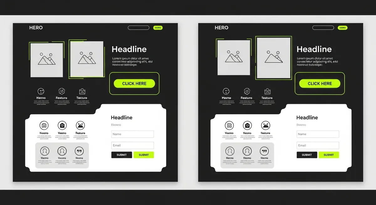
Tip 3: Optimize Above the Fold
Everything visible without scrolling must be convincing enough to make visitors want to keep reading. Hero image or video, headline, subheadline, and CTA button should be visible without scrolling. Visitors decide in 3–5 seconds whether they stay or leave – your above-the-fold area must convince them in that time.
Checklist for the above-the-fold area: headline with a clear value proposition, subheadline with a specific detail, visual element (image, video, or illustration), primary CTA button, and optionally: 1–2 social proof elements (customer count, rating).
Tip 4: Build Trust Systematically
Logos of well-known clients, Google reviews with star ratings, certificates, awards, and press mentions build trust. In the Swiss market, the following are especially effective: logos of well-known Swiss companies as clients, specific numbers ("Over 200 projects for Swiss SMEs"), reviews with real names and companies, and quality seals or certifications. Place social proof elements close to your CTA – that is where the conversion impact is greatest.
Tip 5: Communicate Benefits, Not Features
Customers don't buy features – they buy results. "200 GB storage" is a feature. "Enough space for 50,000 photos – never worry about storage again" is a benefit. Always translate technical features into concrete user advantages. Use the formula: [Feature] → "so that you" → [Benefit]. Example: "Responsive design" → "so that your website looks perfect on every device and no customer is lost."
Tip 6: Systematically Eliminate Friction
Every element that makes visitors think or creates uncertainty reduces the conversion rate. The most common friction points on Swiss landing pages: too many form fields (more than 3–4 is critical), unclear prices or hidden costs, missing answers to obvious questions, no clear next step after conversion, and data privacy concerns without addressing them. Solution: Add an FAQ section that proactively addresses the 5 most common objections.
Tip 7: Think and Test Mobile First
Over 55% of landing page visits in Switzerland come from mobile devices – especially with social media campaigns (Instagram, LinkedIn), the mobile share is often over 80%. Design for mobile first, then for desktop. Mobile-specific optimizations: tap-friendly buttons (at least 44×44 pixels), phone number as a clickable link, simplified forms with auto-fill support, vertical layout without horizontal scrolling, and fast load time (under 3 seconds on 4G).
Tip 8: Load Time as a Conversion Factor
A slow landing page destroys conversions – according to Google, the bounce rate increases by 32% when load time goes from 1 to 3 seconds. Optimize images (WebP format, max. 200 KB), minimize JavaScript, use a CDN, and implement lazy loading for elements below the fold. Aim for a PageSpeed score above 90 on mobile.
Tip 9: Use Urgency Authentically
Urgency (time limit) and scarcity (limited availability) are powerful psychological levers. Authentic examples: "Offer until March 31: 20% discount on all web design packages," "Only 3 project slots left for Q2," "Free initial consultation – limited to 10 appointments per month." Fake scarcity (countdown timers that reset) damages trust in the long run more than it benefits in the short term – Swiss consumers are skeptical of obvious sales tricks.
Tip 10: Test, Measure, Iterate
No landing page is optimal from the start. Implement A/B tests for the most important elements in this priority order: (1) Headline, (2) CTA text and color, (3) Hero image or video, (4) Form layout, (5) Social proof placement. Use tools like VWO, Optimizely, or AB Tasty and iterate based on real data. Successful landing pages are created through systematic testing, not through intuition or "best practices" alone.
Landing Page Budget and Tools
For Swiss SMEs, there are various approaches: DIY with Unbounce/Leadpages: CHF 100–300/month plus your own time, custom landing page from a freelancer: CHF 2,000–5,000 one-time, and agency landing page with strategy, design, and testing: CHF 5,000–15,000. The investment should be proportional to the expected conversion value: with an average customer value of CHF 10,000 and 100 monthly visitors, the landing page only needs to generate 1 customer per month to pay for itself quickly.
Landing Page Types: Which One Fits Your Goal?
Not every landing page is the same. Depending on the campaign goal, there are different types: Lead Generation: Form at the center, typical for B2B companies (whitepaper downloads, booking initial consultations). Conversion rate benchmark: 5–15%. Click-Through: Prepares the visitor for a purchase decision and directs them to the shopping cart or checkout. Typical for e-commerce and SaaS. Squeeze Page: Minimalist, collects only email addresses. Ideal for newsletter building and lead magnets. Conversion rate benchmark: 10–30%. Long-Form Sales Page: Detailed page with story, features, testimonials, FAQ, and multiple CTAs. Ideal for higher-priced products or services that require explanation. According to the Unbounce Benchmark Report, the average conversion rate across all industries is 4.3% – but the top 25% of landing pages achieve over 11%. The difference almost always lies in the quality of the 10 tips mentioned above.
Landing Pages and SEO: Organic Traffic as a Bonus
Landing pages are often created only for paid campaigns (Google Ads, Meta Ads), but the best landing pages also rank organically. SEO-optimized landing pages offer a double advantage: they convert paid traffic AND generate additional free traffic via Google. Requirements: a clearly defined focus keyword in the title, H1, meta description, and in the text, at least 500 words of content (more is better), fast load time and mobile optimization, internal links from other pages on your website, and Schema.org markup (FAQ, HowTo, or product schema). Many Swiss SMEs miss this potential by running their landing pages as noindex pages – a mistake if the page contains high-quality content.
Landing Page Mistakes That Cost Swiss SMEs Conversions
The most common mistakes we see on Swiss SME landing pages: Too many distractions – navigation, footer links, and sidebar elements distract from the conversion goal (remove the main navigation on landing pages). Generic headlines like "Welcome to our site" instead of specific value propositions. Missing urgency element – without a reason to act now, visitors postpone the decision and never come back. No mobile optimization – if the form doesn't work well on a smartphone, you lose 60% of your potential leads. And the biggest mistake: never touching the landing page again after launch. Without systematic testing and continuous optimization, you are wasting enormous conversion potential.
How to Turn Your Landing Page into a Conversion Engine
A high-converting landing page is the result of strategic thinking, good design, compelling copywriting, and systematic testing. Unlike many other marketing measures, the ROI of a landing page is directly measurable – you know exactly how many visitors converted and what each conversion cost. Invest in all four areas and your campaigns will deliver better results.